Saturday, 11 August 2012

LaurenceAirline -Menswear

 If you're looking for a brand who is new and different then look no further! Laurence Airline is a newly established Ready-to-wear Menswear brand whose inspiration is predominantly ethnic prints for their shirt design. The reason why this brand works so well is because it stays true to where it's based, it's a collaborative project in Africa to bring education into fashion, her workshops are ran to allow creativity and to teach couture sewing techniques. The designer Laurence Chauvin-Buthaud is from The Ivory Coast where education is poor, although she has worked abroad her workshop is based here and all the profit from sales is then reinvested back into the project. It's the brands second season and I think it stands a very good chance of many more. They modernise traditional prints and patterns in a way that fits with current trends, they don't just get inspired by Africa as the season shows...

'The concept behind LAURENCEAIRLINE is based on how fashion and ethnic cultures can successfully collaborate to create possibilities for the future.' www.laurenceairline.com


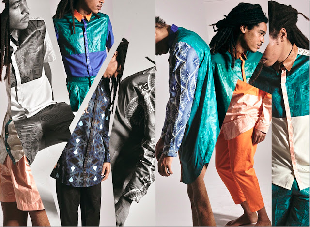
A/W 12-13 CAMPAIGN

This campaign is like a photo montage based on symmetry, it's quite a simple concept but incredibly effective as you do notice the shirt, I like how you can get a sense of where they are based and what has inspired the clothing. 

'A/W 2012-2013: For its second season LAURENCEAIRLINE gives pride of place to the shirt. An invitation to travel, the Fall-Winter 2012-2013 collection takes us on a bold, graphic journey. Colourdul construction and playful materials blend refinement  and character. The fabrics evoke the places visited on a long voyage. Japanese-inspired polka dots meet Scottish plaids on printed wax surfaces. The wax printed peacock spreads his plumes on the shirt's shoulders. The cut and construction evokes the geometric lines of a retro-futurist trip where materials and colours blend into a bewildering balance. And so emerges a sophisticated and elegant wardrobe for men, which has expanded this season into pants and scarves in order to fully furnish the dressing room of freedom-loving modern dandy'

Below are my favourite from their A/W collection, there are many more looks, I choose the ones that showed how innovative the shirt designs are, so check out their website for more from their lookbook;


Adzope shirt-Yamoussoukro shirt

Tamba shirt-Tajima shirt

Fyvie shirt-Falkland shorts
Ricarton shirt- Ralston pants
Anyama blazer- Furano pants

In England they are only stocked at Agnes and Lola who specialise in African designed clothing, I can't find Laurence Airline on their website so maybe they haven't had new stock yet. 

Laurence Airline are a small independent label so I don't know the availability of their stock, as it's handmade in The Ivory Coast so its prices will reflect that.  

S/S Campaign

Their inspiration board

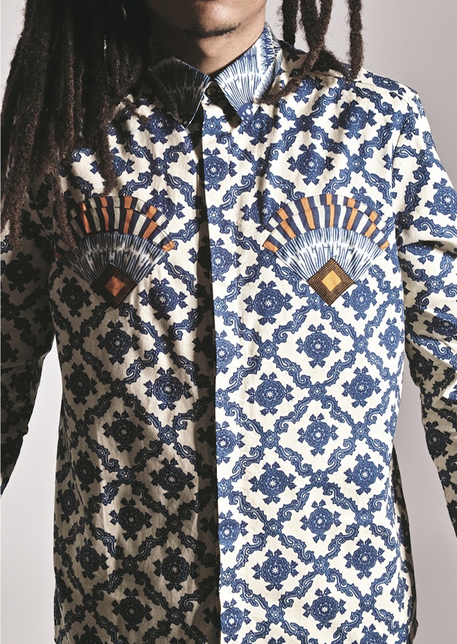
I had to show this shirt, I think its from S/S, but how brilliant is it! With the contrasting  collar and chest detail. 


Thanks for reading,
@QuaintKate

Friday, 10 August 2012

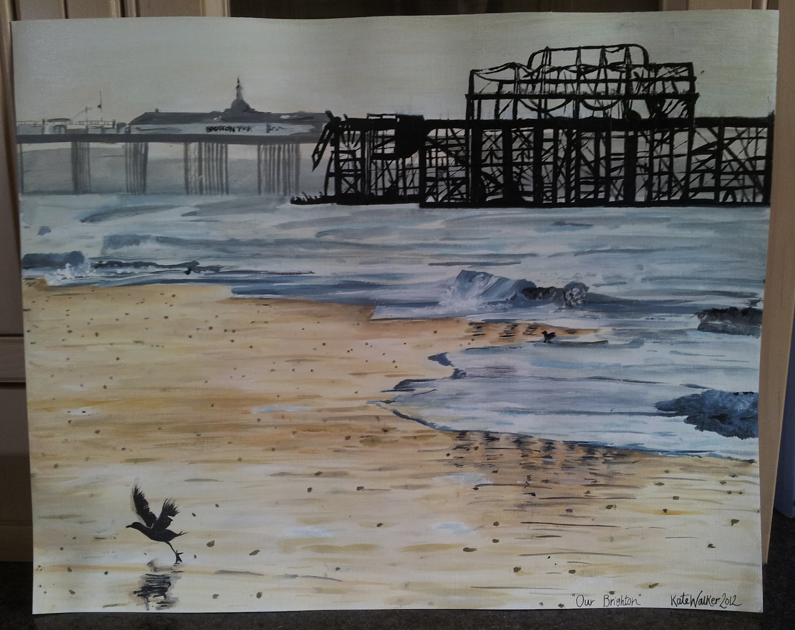
Alex's painting

I did this painting for my boyfriend a week or so ago, it's of the old west Brighton Pier which burnt down. It was a nightmare to paint as there's so much detail! I would be looking at one bit then lose where I was painting, so towards the end I just made up little bits to make it more like the shape of the pier as Brighton is where we will both be studying for uni. I didn't manage to get a photo of him holding it though, and he probably wouldn't of done it, he hates his photo being taken :) Ive taken photos as I've been painting it to show it building up.


It took me a day to do, I woke up at 7AM and worked through the day till about 5ish, thats dedication! I don't like to spend to much time on my work as I tend to over-analyse it, which makes me want to start all over again! I'm pleased with it and I'm confident with acrylic now so I've started trying out different mediums. I've started going to a pastel class with my mum, pastels are quite uncontrollable and are different to acrylic so I'm training myself how to use them and hopefully I'll have some work to post soon,

Thanks for reading,


Thursday, 9 August 2012

Latest Zara

Just a quick post to show a few looks from Zara's new collection. Theres talk of the garments resembling Kate Middleton's style, but I think they look like normal Zara as they've kept the sleek silhouettes they are known for, maybe the shapes are straighter then usual but are still just as gorgeous. The model, Liu Wen, really compliments the clothing as she doesn't need much make-up or hair styling to look gorgeous in the clothing...

Love the tweed mixed with leather adding texture.
STUDIO LEATHER SKIRT £79.99
T-SHIRT WITH PIPED SIDES £15.99


I can see Kate Middleton in this though! It's separates so very versitial 
EMBROIDERED BLOUSE WITH PEARLS £69.99EMBROIDERED SKIRT WITH PEARLS £69.99

JACQUARD LOOM TROUSERS £39.99


JEANS WITH GOLD SIDE TRIM £39.99
EMBROIDERED FAUX LEATHER TOP WITH PEPLUM FRILL £39.99


BLAZER WITH SPIKES ON THE SHOULDER £69.99


STUDIO DRESS WITH LEATHER PEPLUM FRILL £89.99


Freja is one of the models for their new campaign,along with another top model Cara Delevingne, I think this photograph is perfect for the brand as its not trying to over do it and it's relaxed and effortless.

Thanks for reading,
 Check out all their new stuff and dream that you can afford it!! :)


Wednesday, 8 August 2012

Madame Piaggi

Today brought the very sad news that one of fashions most loved and respected journalists has passed away. Anna Piaggi was an Italian fashion writer who wrote famously for Vogue Italia, with such a signature style that makes her unforgettable. Her outfits very totally crazy and looked just quickly thrown together but each component of it isn't a mistake, Anna creates the trends by pushing the boundaries. Her style is her expressing her own version of fashion. Her admirers were at every level of fashion including fashion designers; Karl Lagerfeld and Manolo Blahnik. She had a knowledge of multiple languages, which is why her first job was being a translator but in the 1960's she switched paths to enter fashion Journalism. This proved to be the right move, in the 1970's she landed her first Vogue article and the rest is history!

What I admire about her is how she didn't follow the trends and dressed for herself. She put outfits together in such a unique way, her outfits looked thrown together but within her outfits you can see that it actually hasn't been, she has thought about what the clothes are doing and how they work together . She showcased what fashion could be, not what's in fashion and how to wear the trends, she was showing ideas about print/colour/shape combinations, almost like an inspiration board would do!


'Ah, Stephen, I am doing a wonderful thing and I need a new hat..' DailyMail

'I think she’s a poet with clothes, but a very fine poet.' Vogue.com

'It doesn't have to be Dior with Anna. She's always worn 1920s shoes with Dolce trousers and a vintage Patou coat and a plastic belt, and a ski pole for a walking stick and crazy blue hair and a funny hat. She's about the possibility of what fashion can be.' HINT MAGAZINE

 'My life is quite normal. But I enjoy dressing all the time..' Paper Magazine

JAN 2006 – With Vivienne Westwood at the Fashion-ology exhibition.

"Hats are like a halo of happiness," 
she told Stephen Jones at the event. 


Hormazd Narielwalla

I discovered this illustrator whilst at college, he really helped me to get inspired for a project about unconventional fashion illustration. I was drawn to his work as it's a different way of combining fashion and collage together. He recycles old dress making patterns and creates them into a fashion portrait. 

'I’m working on some new art and have chosen to draw and collage impressions of Anna Piaggi. She is quite the fashion icon, I have used a combination of 1930 Pre-War tailoring patterns from a Thornton’s Cutting Book – lot’s of shapes and colours have been used to bring her to life.'  


He has captured her love for her avant grade millerny and sense of mixing up a silhouette and colour.
I hope she is forever remembered.
Thanks for reading,


Tuesday, 7 August 2012

Something special came in the post..

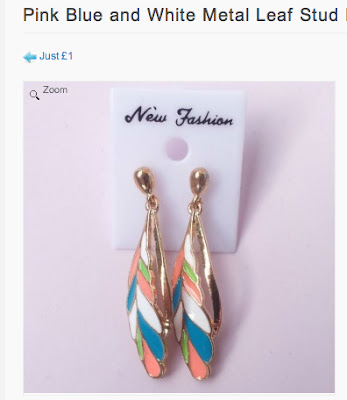
I was doing my daily catch up on twitter when I saw a fellow fashion blogger had posted a FREE gift tweet. The tweet was for a free pair of earrings from a website called Lissele Jewellery, which is run by a young girl from London who sells so much jewellery, I don't know how she does it! Anyway she has a section where all the items are £1 which is a bargain! You had to pick a few favourites and she would send you one of them. I hoped I'd get these and I did :) They are underwater inspired with shells and sea horses- I thought they were quite different and unique. 

 
What arrived in the post this morning! Below is me posing away with them :)


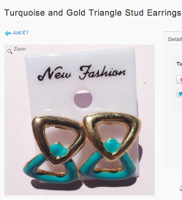
 Below are a mine and a few other earrings I liked in the £1 section...


Follow her on twitter @LisseleJ 
Her website is: http://lisselejewellery.com
Thanks for reading,


Monday, 6 August 2012

Eighties into fabulous forties

Guess who's found a new vintage shop! 

I went to my favourite charity shops in Studley and right next to one is a vintage shop called Reminisce. It's only small and is mostly furniture, but it has very reasonable prices and I would say their best thing there is jewellery, there's so much to look through! On the clothing rail was a few dresses along with the usual vintage items; WW2 jackets, petticoats, knitted jumpers, cotton blouses but the dresses were nice compared to what I usually see. In particular, I don't like the polyester bright 70's/80's dresses that are a common find, sometimes there are really cool but they tend to be way too big and can't really be altered without undoing all the seams and remaking the whole dress.

My find- When I saw this dress on the hanger I fell in love with the print, as well as the price tag! The colours are perfect! It did look quite big though, on the label it read a size 18, but it's one of those dresses that when you add a belt at the waist it totally transforms it and I do think its more like a 12/14. 
I reckon this dress is from the 80's because of the fabric and the excellent condition it is in but I feel by rolling up the sleeves to make them 3/4 and by clinching the waist with a belt it creates a look reminiscent to those of the 40's. The belt creates a yoke (the space between the belt and the drop waist) that would usually only be seen in skirts, this combination of a yoke and pleats were a common occurrence in the 40's.


Oh and also I was trying out a hair style I saw on Kate Nash, a middle parting with front rolls, she left her hair down curly but for this look it suited a ponytail. I haven't quite perfected the technique of doing it but I hope with practise I will :) 

My mum's wall ornament looks like some crazy avant-garde head piece! 


If you're wearing something that is too big, I find it looks better if you roll up the sleeves as it shows of the thinest part of the arm and if you can the clinch the waist with the belt. 

All the info you need if you want to check it out :)

Thanks for reading,


Thursday, 2 August 2012

Summer Painting


Since I've finished college I've filled the time by carrying on with my interest in fashion, but I have started creating some paintings. I'm still researching fashion and finding upcoming designers/trends/street style/collections, which I do want to blog about, but I do have a reason why I haven't! I've been busy painting, whilst at college I did a little bit of painting but mostly drawing so it was quite daunting to start a proper painting. It started by my mum wanting paintings for her house, so we matched photographs to fit in with each room that she liked. My style is realistic but I like to think I add an old fashioned/vintage twist by the colours I use and how I paint it..

Crashing Waves


This painting was so hard! I should have expected it would be as I've never attempted water before, it's hard as there's so much detail but it's so subtle and is all in the same tone and colours, so its hard to make it stand out. This is my first canvas painting and it's going in my mum's room.. 

I set up my own mini studio in my mum's conservatory which was cool as I had my own space to work in but wasn't as glamourous as it sounds as the only way I could get the canvas to stay up was to prop it up against the chair so I was sat on the floor!

I painted it over 2 days, it took me about 8/9 hrs, these are photos over the period to show how I built it up at different stages. I probably have built it up wrong as you are meant to underpaint and all that but I find painting easier to do it section by section.


 I chose my favourite sections from my canvas here, I really liked the white crashing parts in the photo so that is what I wanted to highlight with the painting and I didn't forget to sign it this time!

Old Paintbrushes

This was my second piece on A2, I've always liked how paintbrushes age with old paint layering on and flaking off and the stained colours on the brush, so when I found a photograph showing this I knew I had to paint it. I changed the colours and background slightly to fit in with the lounge ...

I started this off by just painting the top half of the brushes, I know it sounds strange but the glass changed the shape of the brushes in the jar as it was a shaped curved jar so I thought it would be better to build the other half of them up with the glass.

Glass finished! I really like the highlighted right side of the jar with the white as it shows the shape and form, I did manage to make a few accidental marks on the paper so I had to layer the backgrounds colours on thickly.

A camera flash is a nightmare with glass so excuse the flash mark! I decided to go for a light blue and brown for the background, I purposely made the shelf edge a little unsteady as that was the shadow.

Bottles of Flowers

This is my first proper painting I've done, when I started it I really thought I wouldn't finish it as the bottles were hard to get the hang off and so was working out how to show the transparency of the glass but I figured out that layering thin washes of paint worked well. This time I painted the background  first then painted the bottles one by one...


Half way through, I had a real problem with this dark bottle as I painted it too dark so I kept lightening it up and trying to add highlight and shadow, which took sooo long! I really enjoyed painting the flowers though.

This took me the longest, about 3 days but I'm really pleased with it and it inspired me to do more as originally I was just going to create one painting but I want to keep going and trying out new subjects and painting styles.

So they are all the paintings I've done so far but I'm hoping to do a few more so I'll keep you updated hope you like my paintings!

Thanks for reading,